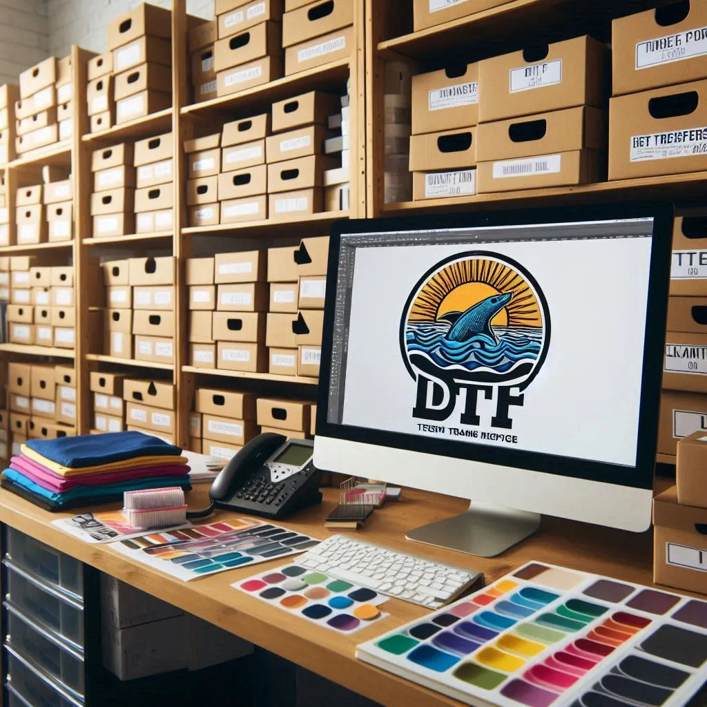
How to Choose the Right Background Color for Your DTF Prints
How to Choose the Right Background Color for Your DTF Prints
Choosing the right background color is key in making your custom apparel stand out. It affects the quality, vibrancy, and look of your DTF prints. This guide will help you pick the perfect background color for your t-shirt designs and custom apparel.
Key Takeaways
- Discover the importance of background color in DTF printing and its impact on print quality and visual appeal.
- Explore color theory principles to make informed decisions about complementary and contrasting color combinations.
- Learn how to consider the product and its intended use when choosing the ideal background color.
- Understand the significance of aligning background colors with your brand's identity and visual theme.
- Gain insights into testing and experimenting with different color combinations to achieve maximum impact.
The Importance of Background Color in DTF Printing
Choosing the right background color for DTF printing is key to the quality and vibrancy of your prints. The right background boosts the clarity and intensity of your designs. On the other hand, a poor choice can dull the colors and create an unwanted contrast.
Impact on Print Quality and Vibrancy
The background color you pick greatly affects the print quality and color vibrancy of your custom apparel designs. A good background makes your prints stand out, with rich, vibrant colors that match your artwork. But, a bad choice can lead to dull, washed-out prints that lose their impact.
Enhancing the Overall Aesthetic Appeal
The background color also plays a big role in the aesthetic appeal of your DTF prints. The right background can make your design look cohesive and striking, improving the look of your custom apparel. By thinking about the color palette and how it fits with your artwork, you can make a polished, engaging final product.
|
Background Color |
Impact on Print Quality |
Impact on Color Vibrancy |
Impact on Aesthetic Appeal |
|
White |
Excellent print clarity |
Vibrant and true-to-color |
Clean and modern |
|
Black |
Sharp and defined prints |
Bold and intense colors |
Dramatic and eye-catching |
|
Pastel shades |
Soft and subtle prints |
Delicate and muted tones |
Airy and sophisticated |
The background color for your DTF prints greatly impacts the quality, vibrancy, and look of your custom apparel designs. By thinking about these factors, you can make prints that really grab attention and impress your audience.
Understanding Color Theory for DTF Prints
Learning about color theory is key to making great custom apparel designs, especially for DTF print design. Knowing how different colors work together on the color wheel helps you pick colors for your custom apparel color selections. This makes your designs look amazing and grab people's attention.
The Color Wheel and Color Relationships
The color wheel is the core of color theory. It shows how colors relate to each other. Getting to know the wheel and its color relationships helps you choose the right colors for your DTF prints.
- Complementary colors: These are hues that sit opposite each other on the color wheel, such as blue and orange or red and green. When used together, they create a striking and vibrant contrast that can make your DTF prints stand out.
- Analogous colors: These are colors that are next to each other on the color wheel, like blue, blue-green, and green. Analogous color schemes often create a harmonious and cohesive look for your custom apparel.
- Contrasting colors: Colors that are far apart on the color wheel, such as yellow and purple or red and blue, can create a bold and attention-grabbing effect when used as background colors for your DTF prints.
Understanding these color principles lets you make custom apparel that looks great and leaves a strong impression.
Considering the Product and Its Intended Use
Choosing the right background color for your DTF prints is key. Think about the product type and its intended use. The color should match the design and fit the product's purpose and audience. It should also match your brand aesthetic. This way, your custom apparel will connect with your customers and show off your brand.
For DTF prints on athletic wear, pick a bright and lively color. Think about using a bold primary color or a high-contrast neutral tone. This matches the active vibe of the product and will draw in fitness lovers.
But, for DTF prints on formal or evening wear, go for a calmer and more refined color. Consider rich jewel tones or sophisticated metallics. These colors add a touch of elegance fitting for formal events.
Remember, when picking the background color for your DTF prints, think about the product type and its intended use. This ensures your custom apparel hits the mark with your audience and showcases your brand's unique style.
Choosing Complementary Colors for Maximum Impact
Choosing the right colors for your DTF print backgrounds can really make a difference. Complementary colors sit opposite each other on the color wheel. They create a strong contrast that grabs attention right away. Using these colors together can make your custom apparel designs pop.
Contrasting Colors for Bold Statements
For a bold look, try using contrasting colors for your DTF print background. Colors like red and green or blue and orange work well together. They create a dynamic look that gets noticed. This is great for making custom apparel that stands out and leaves a strong impression.
Learning about color contrast opens up many creative options for your DTF print backgrounds and custom apparel. By using complementary colors and bold designs, you can boost the visual appeal of your products. This helps you grab the attention of your target audience.
Background Color, DTF Prints
Choosing the right dtf print background color is key to making your custom apparel design stand out. It affects how visible and compatible with colors your print will be. The background color you pick is vital for a design that looks good and connects with your audience.
The background should match the colors and elements in your design. This choice boosts the print quality, makes the design more impactful, and blends your artwork with the garment smoothly.
Here are some tips for picking the right background color for your DTF prints:
- Understand how the background color adds to your design's look.
- Use color theory to find colors that work well together for a strong effect.
- Think about the use and purpose of the product to match the background color with your brand and theme.
- Try out different colors and see how they look in the final print to get the best print visibility and color compatibility.
By thinking about the background color, you can make custom clothes that show off your creativity and speak to your audience. Spend time exploring and trying out various colors to find the perfect one. This will make your dtf print background color pop and bring your idea to life.
Matching Background Colors to Branding and Theme
Choosing the right background color for your DTF prints is key. It should match your branding and theme. A consistent brand identity makes your products look professional and recognizable.
Match the background color with your brand's colors and design. This makes sure your custom apparel fits well with your marketing efforts. It also makes your products look better and strengthens your brand's unique style.
Maintaining Brand Consistency
Choosing the right DTF print background is important for brand consistency. Stick to your branding guidelines and colors for a professional look. This builds trust with your audience and helps with engagement and sales.
- Think about how the background color fits with your brand's logos, graphics, and marketing.
- Try out different shades and hues to find the best match for your brand identity.
- Keep your DTF print background the same across all products to stick to your brand theme.
Choosing the right DTF print background for your branding and theme makes your custom apparel look cohesive and appealing. It connects with your audience and strengthens your brand consistency.
Testing and Experimenting with Different Color Combinations
Finding the right background color for your DTF prints is fun and full of discovery. It's all about color experimentation and trying out different color combinations. This way, you can see how they work with your design and how they look overall.
Through design testing, you can find a background color that makes your custom clothes look great. Try out many colors, shades, and tones to find the best dtf print background. This will make your custom apparel optimization stand out.
- Begin by making mockups with various color combinations.
- See how the color experimentation changes the look and feel of your DTF prints.
- Ask people what they think to get their opinions and reactions.
- Use what you learn to improve your color combinations in design testing.
- Keep testing and tweaking until you find the perfect color that matches your designs and brand.
By being open to color experimentation and design testing, you can make the most of your dtf print background. This will help you optimize your custom apparel for a big impact.
|
Color Combination |
Aesthetic Impact |
Customer Feedback |
|
Navy blue and white |
Elegant and sophisticated |
Positive response, felt professional and modern |
|
Vibrant orange and soft gray |
Energetic and youthful |
Mixed feedback, some found the contrast too bold |
|
Earthy green and neutral beige |
Calming and nature-inspired |
Positive feedback, complemented the organic feel of the designs |
Popular Background Color Choices for DTF Prints
When picking DTF print background colors, some colors are more popular for their versatility and timeless look. Neutral tones like crisp white, sleek black, and sophisticated gray are top picks for custom clothes. These colors give your design a clean base. This lets your design shine without getting lost.
Neutral Tones for Versatility
Neutral colors are great for DTF prints because they work well with many color schemes and designs. They're perfect for bold, vibrant designs or subtle, minimalist looks. This makes them a favorite among those who want their designs to fit different styles.
Choosing the right background color for your DTF prints depends on the product, its use, and your design goals. Think about how color affects print quality, vibrancy, and looks. This way, you can make choices that improve your custom apparel.


Leave a comment
This site is protected by hCaptcha and the hCaptcha Privacy Policy and Terms of Service apply.